Millions of players. Millions of winners. Thousands of good causes. One brand making extraordinary happen for everyone.
Friendly and flexible, the tailor-made typeface TNL Effra is used across all games and brand touchpoints.
TNL Effra
First created in London, Effra is a typically British typeface, giving it the ideal origin story for the brand. To ensure it feels even more fitting for us, it has been further customised to give The National Lottery a unique, personalised voice.
Clean, versatile and modern, it provides the perfect foundation to express the brand in interesting and characterful ways.

Weights
Alongside the use of upper and lowercase, we use a range of weights to help provide hierarchy to our messaging. Try not to use uppercase too often though - we're not ones to shout. Oh, and while we're the laying ground rules: no italics, please.
TNL Effra
Heavy
Great for attention-grabbing headers and big numbers.
TNL Effra
Regular
Great for body copy and alongside imagery.
TNL Effra
Light
For longer chunks of text, this should be your go-to.
Line height (leading)
15% less than the font size.
Letter spacing
(tracking in Adobe)
-2.5% of the font size.
Kerning
Optical
UPPERCASE
EXAMPLE
01
UPPERCASE
EXAMPLE
01
Font size:
80
Line height:
68
Letter spacing:
-2.0
Tracking:
-20
UPPERCASE EXAMPLE 02
UPPERCASE EXAMPLE 02
Font size:
42
Line height:
36
Letter spacing:
-1.1
Tracking:
-11
UPPERCASE EXAMPLE 03
Font size:
28
Line height:
24
Letter spacing:
-0.7
Tracking:
-7
Line height (leading)
5% less than the font size.
Letter spacing
(tracking in Adobe)
0.5% of the font size.
Kerning
Optical
Lowercase
example
01
Font size:
56
Line height:
53
Letter spacing:
0.28
Tracking:
2.8
Lowercase
example 02
Font size:
34
Line height:
32
Letter spacing:
0.17
Tracking:
1.7
Lowercase
example 03
Font size:
24
Line height:
23
Letter spacing:
0.12
Tracking:
1.2
Type pairings
To create engaging, easy-to-read and impactful layouts, using a variety of different weights, cases and sizes. Here are some examples to get you going.
EXAMPLE 01
Secondary line
Example 02
SECONDARY LINE
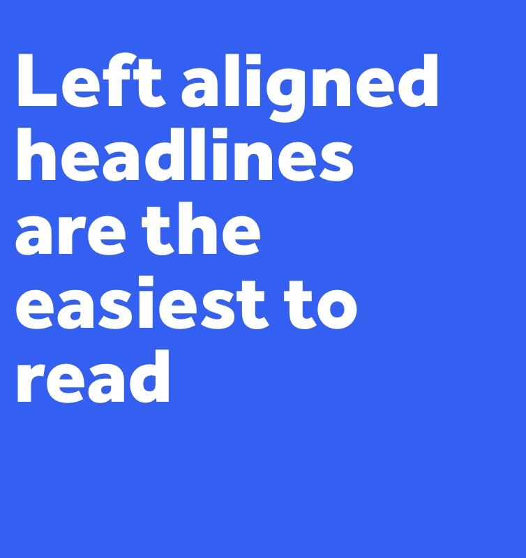
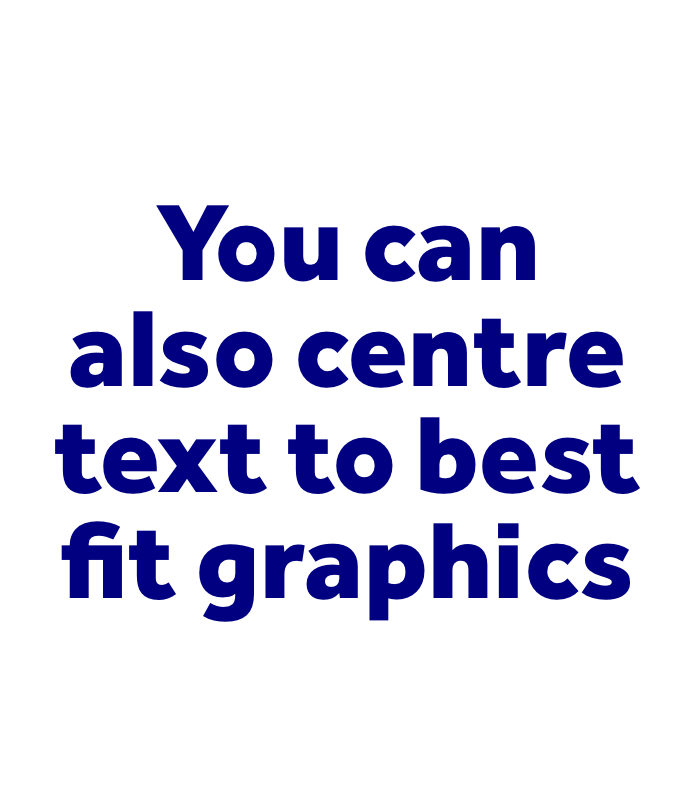
Alignment
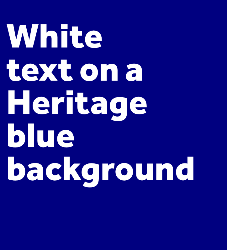
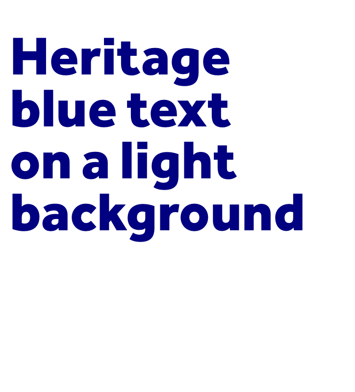
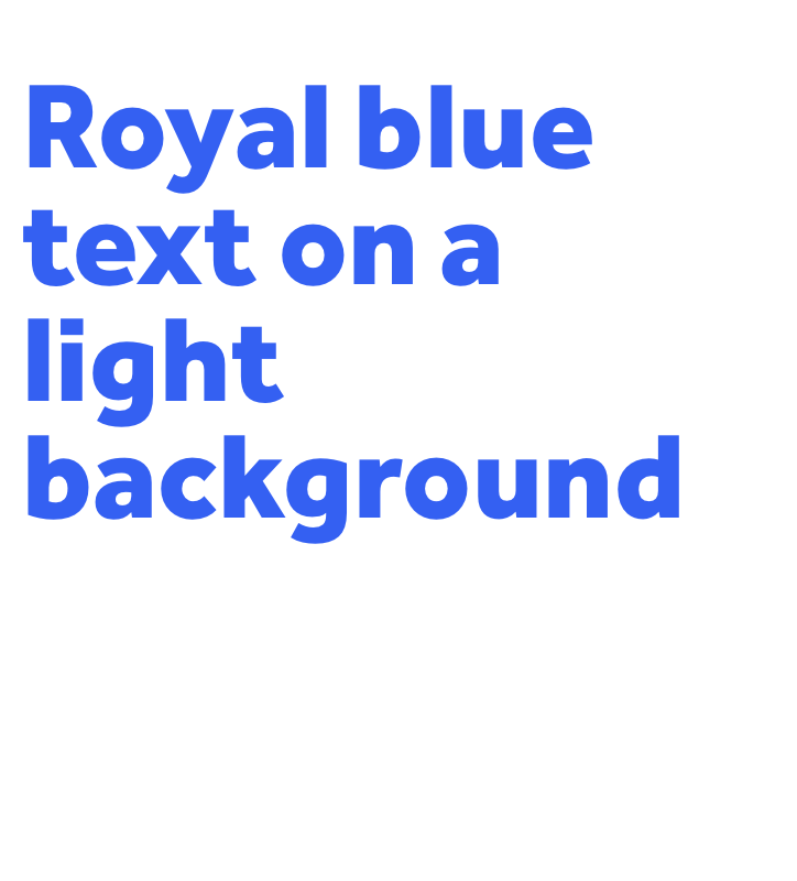
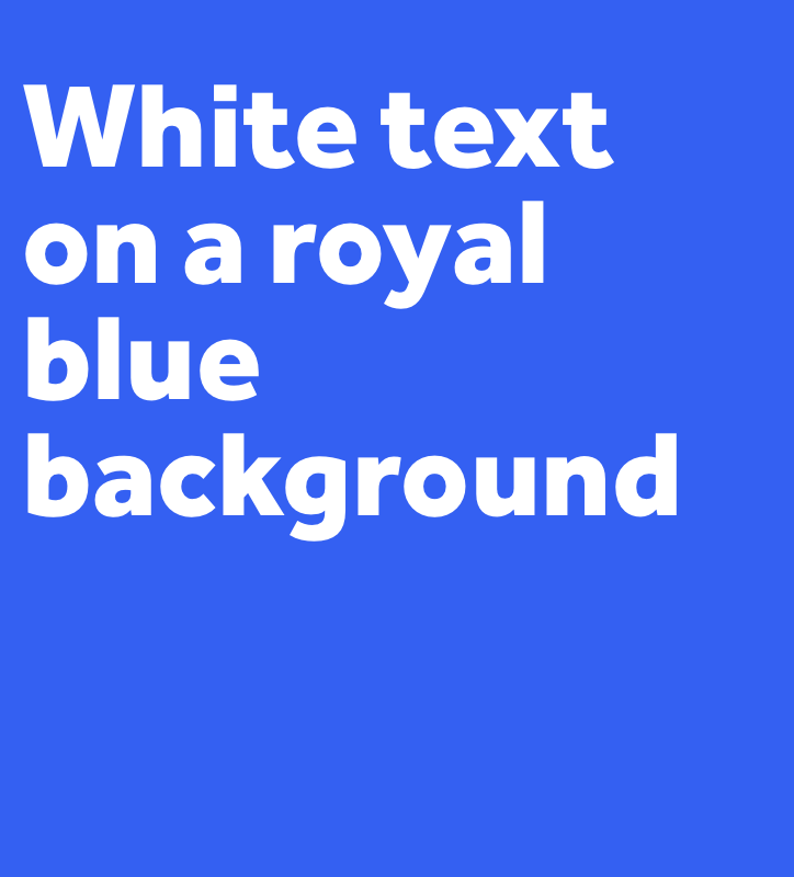
Font colours
For consistency and to ensure we meet AA accessibility guidelines, stick with these colour combinations.
We never use black unless needed for printing in B&W.
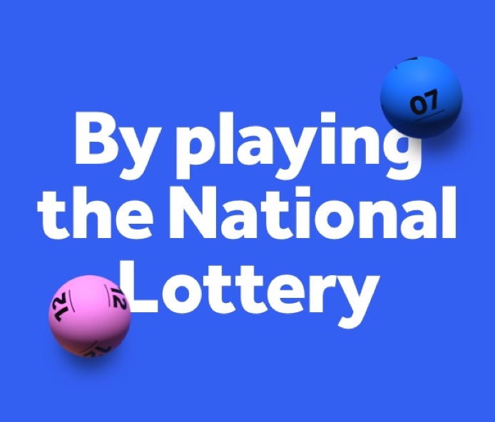
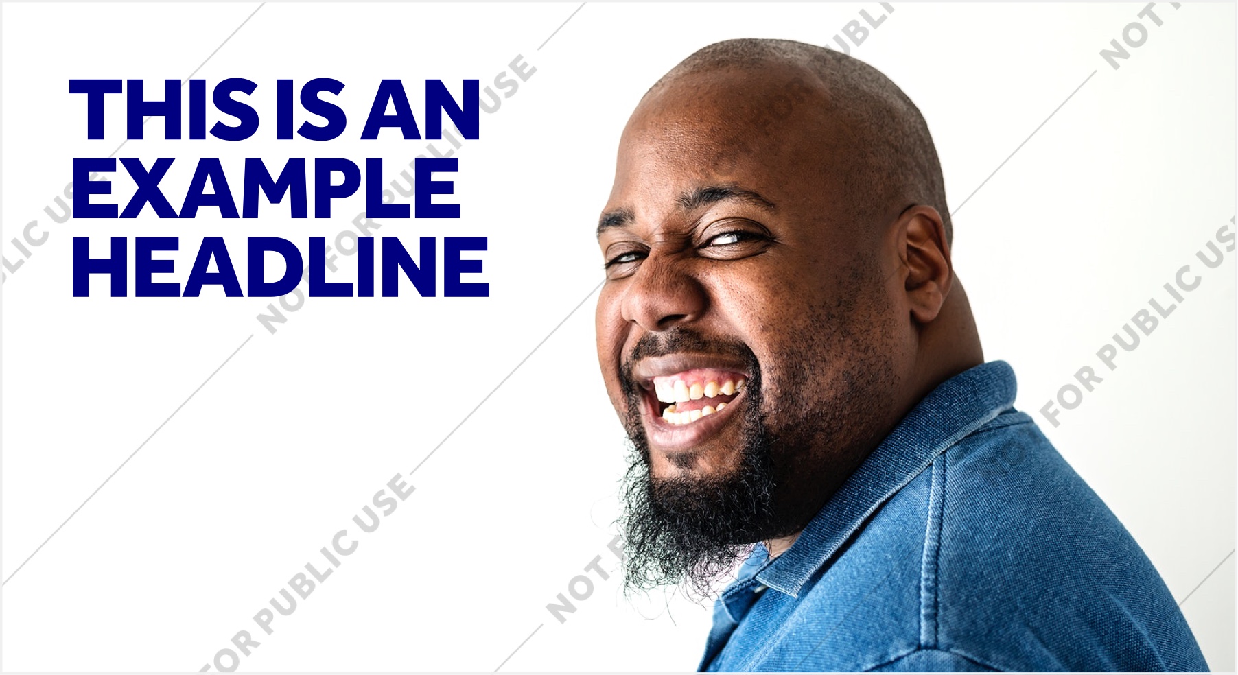
Type & imagery
When using alongside imagery, keep typography to areas of clear space to boost legibility and let the image shine.
In general, avoid using type & imagery together on responsive websites, as it's hard to stop type and imagery blocking one another.
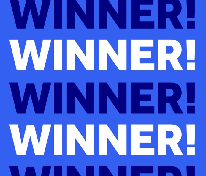
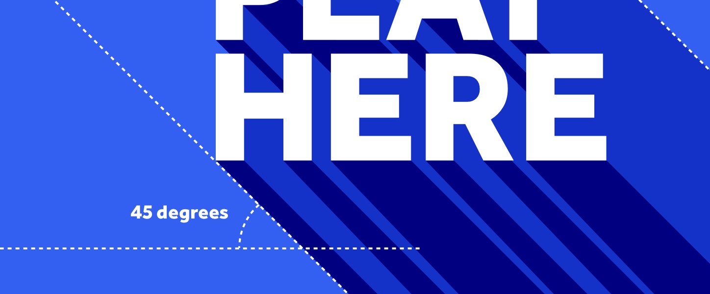
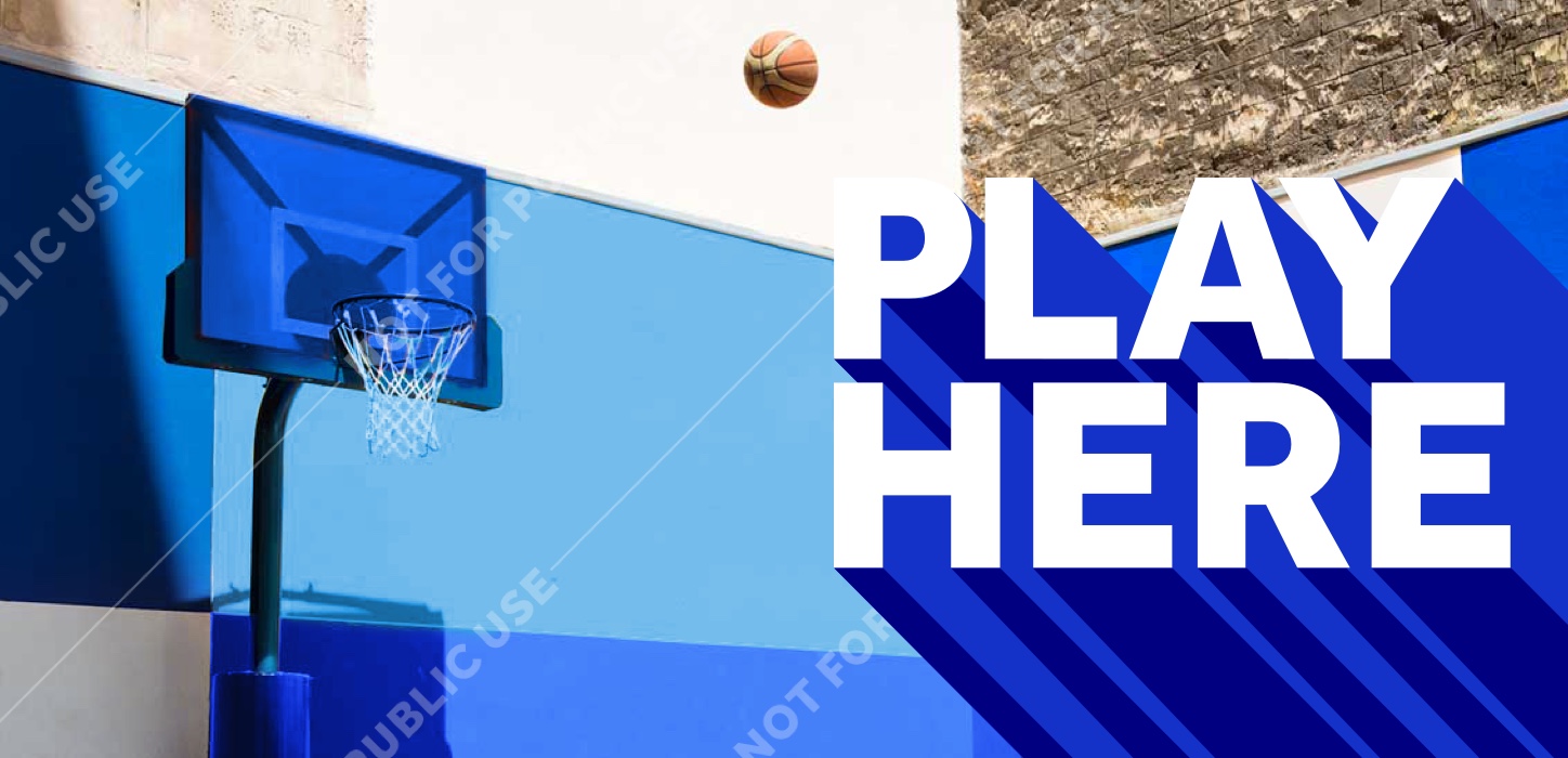
Extruded type is a great new tool in our box, created to bring character and impact to key messaging.
Extruded type
Extruded type
Across the brand and all games, we've created a range of extruded type treatments to drive distinctiveness and personality. We use them primarily when our messaging really needs to stand out e.g. jackpots and events.


Live text vs static
There are two versions of the extruded type for different occasions. When type is static, use the more detailed version. When using live text - or in busy environments - use the simplified version.
The use of extrusion for live text on owned channels is currently in feasibility testing - watch this space for more.
Live text

Static text

Angles
Created by extruding your type at a 45° angle to the bottom-right of the canvas.
Typography misuse
Extruded type is made to stand out, right at the top of the messaging hierarchy. As a result, it needs to be used wisely - avoiding using it alongside other elements such as imagery wherever possible.
Don’t combine with photography

Don’t make the extrusion a secondary message

Don’t crop extrusions

Don’t use multiple font weights
System in use
Find more examples of how assets come to life at the 'System in Action’.
To see more examples of how the
assets come to life see the
‘system in action’ page.