Millions of players. Millions of winners. Thousands of good causes. One brand making extraordinary happen for everyone.
Illustration is a great tool to tell stories, create excitement and make functional messages feel more approachable.
TNL Illustration
Illustration can enhance user experience, help us communicate more effectively with players and invite them into our world. The style we use is consistent across characters, scenes and icons.
Our Style
We use one style of illustration… and it’s bursting with personality. The look is simple and graphic, but the feeling it creates is joyful and welcoming.

Rounded Style
We prefer smooth curves to sharp edges, with our faces, environments and props all built from rounded shapes to directly link them back to our National Lottery game balls, which are a key brand asset.
People and Emotion
By featuring people from diverse backgrounds, we build deeper connections with players. Simple, joyful facial expressions convey the emotion of a moment.
Simple Details
Simple details add context, depth and charm to our illustrations. We should use the minimum amount of elements required to tell a story and avoid any complexity.

Functionality
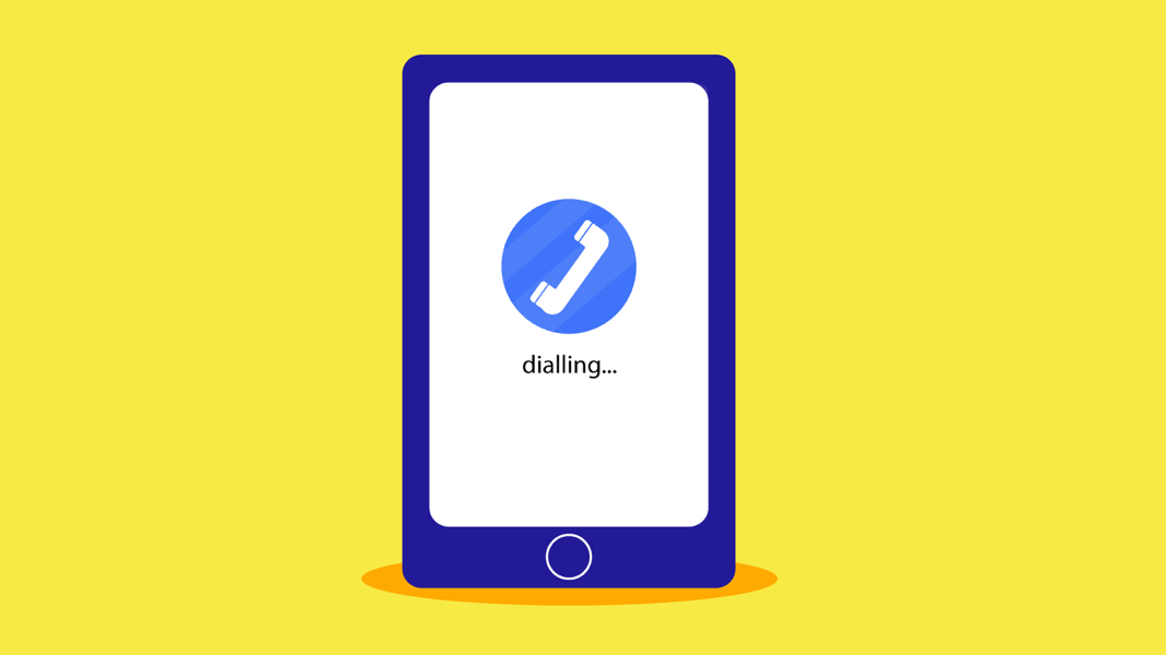
Our illustrations not only convey joy but also make instructions and information easier to understand. For these more functional messages, we use simple shapes with minimal detailing.
Colour plays an important role in bringing joy to our illustrated world.
Palette
Our brand colours - Royal blue and Heritage blue - should feature prominently in our illustrations. However, we want our world to still feel vibrant, so we've also added new colours to our palette. These fit seamlessly into our game colour worlds without being associated to any one game.
Royal blue
#3460F2
C:90 M:48 Y:0 K:0
Pantone 285C
Heritage blue
#000080
C:100 M:95 Y:0 K:30
C:100 M:95 Y:0 K:30
C:100 M:95 Y:0 K:30
Pantone 2748C
Secondary blue (for use as a background colour on digital journeys)
#4F7BF7
C:68 M:50 Y:0 K:3
Pantone 2727C
Mint
#00E69E
C:100 M:0 Y:31 K:10
Pantone 3395C
Magenta
#FF0092
C:0 M:100 Y:43 K:0
Pantone Pantone Rhodamine Red C
Lilac
#B744FF
C:28 M:73 Y:0 K:0
Pantone 2585c
Orange
#FFAC00
C:0 M:33 Y:100 K:0
Pantone 137C
Yellow
#FFED00
C:0 M:7 Y:100 K:0
Pantone 102C
Coral
(Not be used as a background)
(Not be used as a background)
#FF005C
C:0 M:100 Y:64 K:0
Pantone 192c
Skin tones
We use a set of four shades to represent players with different skin tones. Skin colour should always be considered within the overall aesthetic of the illustration, ensuring that it is the right cultural fit and being sensitive to the overall look.
Skin 1
#FCA6A2
C:0 M:34 Y:36 K:1
Pantone 169C
Skin 2
#FA964D
C:0 M:40 Y:69 K:2
Pantone 150C
Skin 3
#AE310C
C:0 M:72 Y:93 K:32
Pantone 174C
Skin 4
#321E0F
C:0 M:40 Y:70 K:80
Pantone Black 4c
Game World Colours
Game World Colours
Our game world colours should be used for game specific illustrations or can be used sparingly in non game specifc illustrations.
Lotto
Euromillions
Euro-millions
Hotpicks
Instant Wins
Thunderball
Thunder-ball
Set For Life

Game Specific illustrations
When creating game specific illustrations, our game world colours should be used as a background or make up at least 30% of the illustration colour.

Non Game Specific illustrations
When using game world colours in non game specific illustrations, they should make up no more than than 10% of the illustration colour.
Player Perspective
Players are at the heart of our brand, so we can tell stories from their point of view. Using illustrations of hands (close-up or as part of a larger scene) we create emotional appeal and functional value.
Icons
Our simplest illustrations are our icons. We use them to convey information quickly and clearly. To achieve consistency, every icon appears inside a coloured circle and features Heritage blue, Royal blue and a maximum of one other shade from our palette.
A joy to play.
A joy to watch. That’s us.
Motion
We create a moving world that captures the energy and excitement of our games and wider brand world. Bold and light-hearted, it appears as a seamless extension of our illustration style.
Illustrations: Characters
As a brand with people at the heart, characters are important to us. We use them to represent our players, so they should move and express themselves in a way that feels realistic, never overly exaggerated.
Illustrations: Elements
Our illustrations often have a functional role to play. For example, guiding new players through their sign up journey.
To keep the energy levels up, we show our page elements in constant motion - every step appearing to flow into the next. We also inject personality into individual actions, such as clicking or scrolling.
Transitions
Every scene should appear to flow into the next one. To create an unbroken chain of events, we get smart with our transitions. Instead of hard cuts, we use techniques such as zooming in (and out) of the action and morphing from one shape to another, similar one.
Pacing and timing
We’re always on the go. But, just as in the real world, it’s not at a perfectly steady pace. We move from fast to slow to give audiences time to focus on the element being introduced. Remember: even when we do slow down, we’re still moving.
Mixing 2D & 3D
We use a mixture of 2D and 3D animation to add more depth and dynamism to our scenes. We integrate these 2D and 3D elements together, ensuring that they move at the same pace.
Previous section
Next section