Millions of players. Millions of winners. Thousands of good causes. One brand making extraordinary happen for everyone.
How we bring the two sides of TNL together: great prizes and good causes, big wins and little surprises.
Core photography principles
To bring the TNL identity to life, there are a few simple principles to follow:
All TNL imagery must...
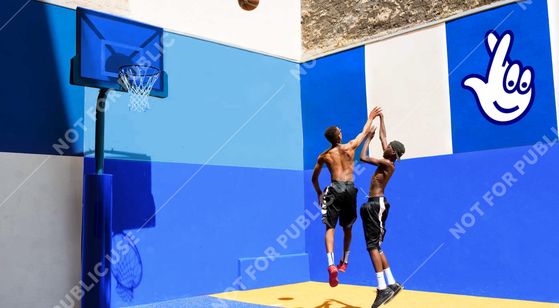
01
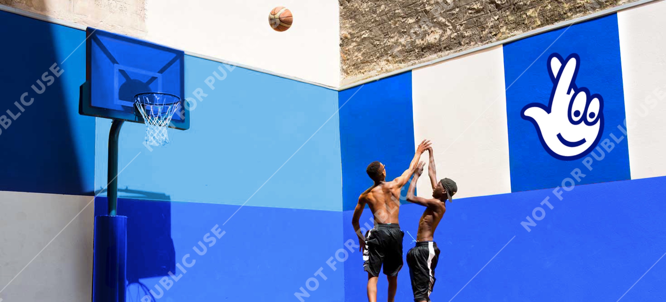
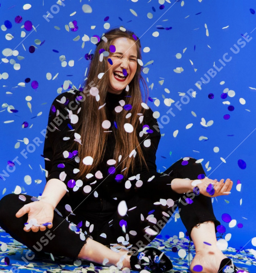
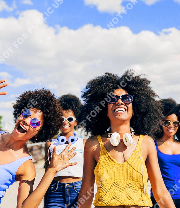
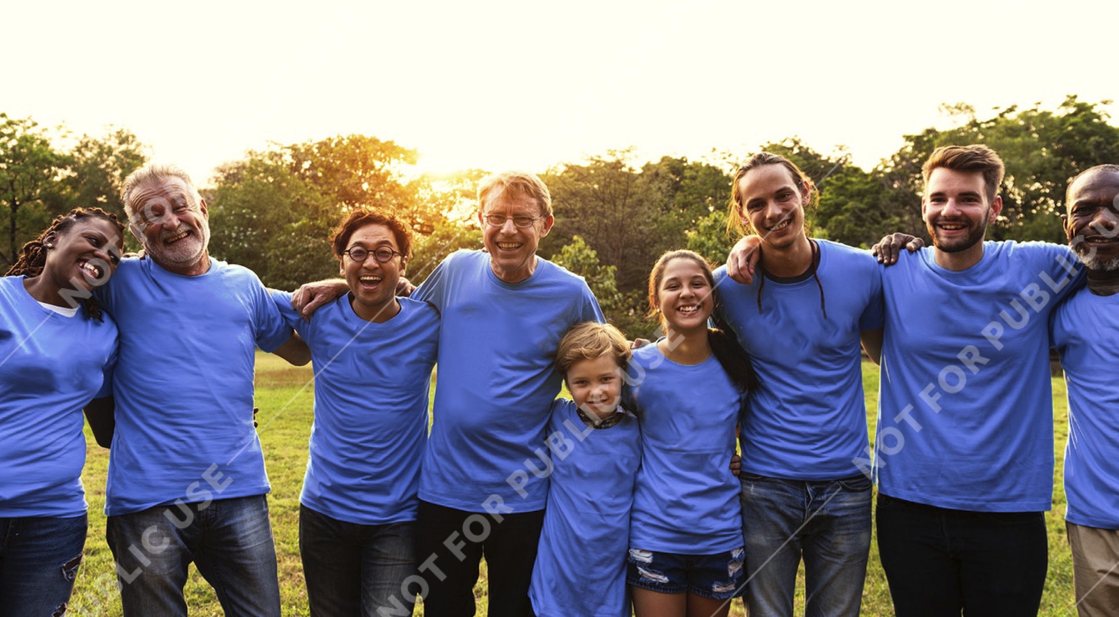
Capture moments of joy that feel candid and fully in the moment, never staged. When using confetti in scenes of celebration, use the brand colour.
02
All imagery should feel bright, colourful and full of optimism – using natural light whenever possible.
03
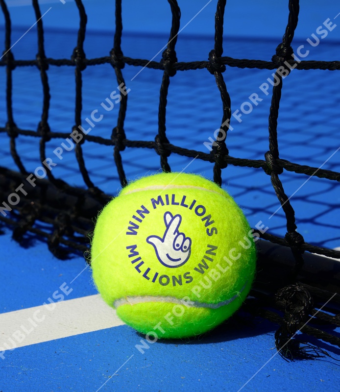
Less is more, so keep imagery simple with an obvious focal point.
04
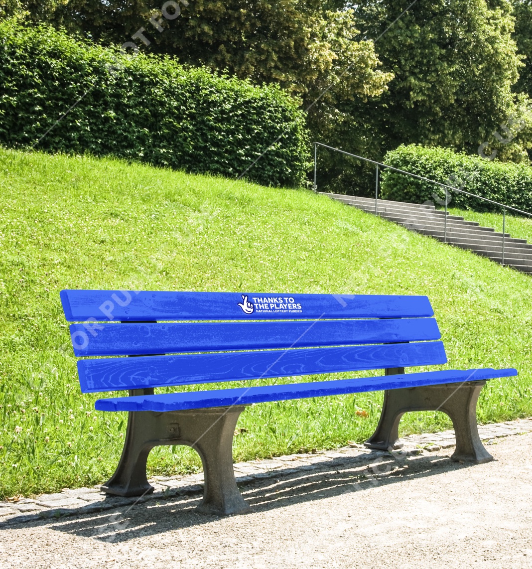
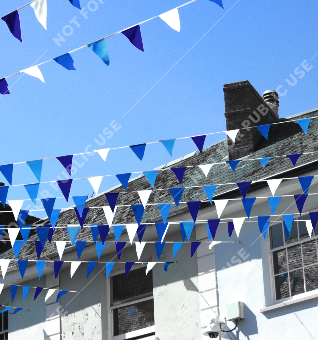
The colour blue is key to creating imagery that’s more ownable to TNL. Lead with it across clothing, props and backgrounds – from brooches to benches to blue skies.
05
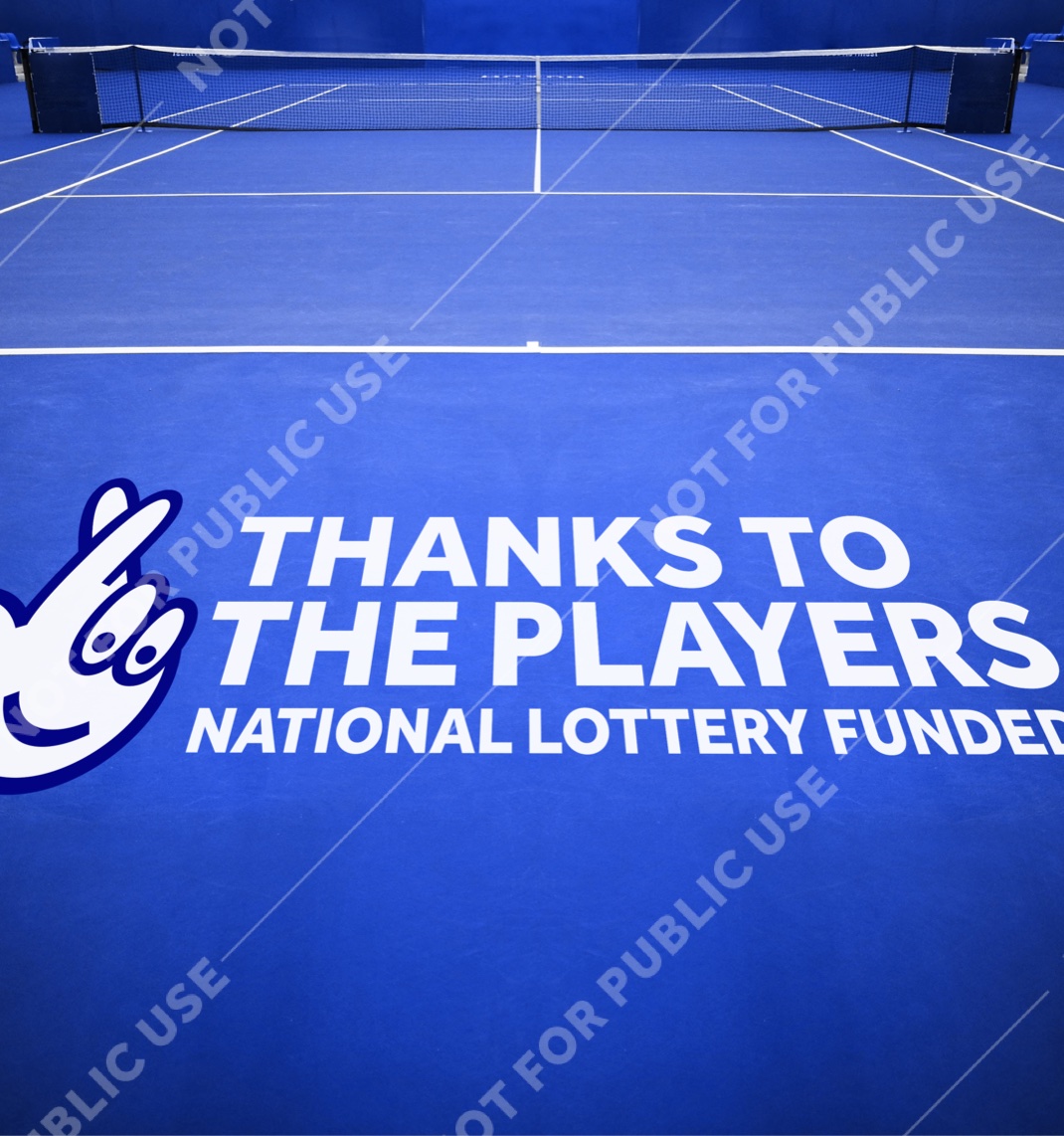
Imagery that highlights our brand helps provide context, drives recognition and connects The National Lottery to the winners and good causes being depicted.
06
The people and communities we feature across the brand and all games should be a mixture of sexes, ethnicities and ages over 25. One exception is Good Causes imagery. Here people of all ages can feature, so long as they’re with someone over 25.
What to photograph
Real moments, amazingly told. Scenes with a clear sense of place - and objects that are connected to national life and culture.
The visuals below are intended to be inspirational, rather than instructive. Images shown are not for external publication.

Previous section
Next section