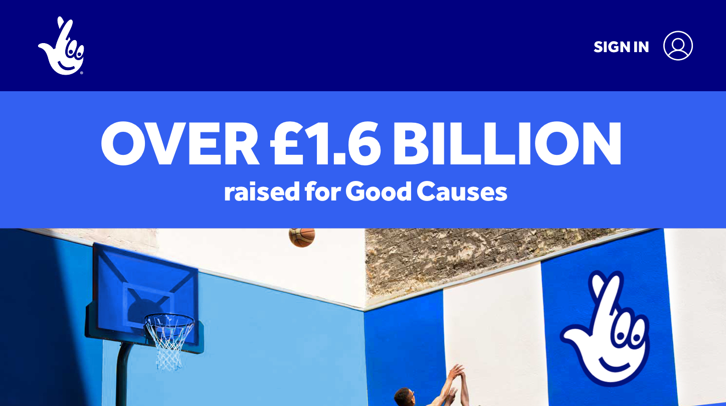
Millions of players. Millions of winners. Thousands of good causes. One brand making extraordinary happen for everyone.
In our new visual system, colour is king - helping to bring each game to life and aiding navigation.
Palette
Born from the original 1994 identity, Heritage blue is our hero colour, bringing richness, credibility and heft to the party. We use it in balance with the more vibrant royal blue to give our brand more freshness and modernity to play with. royal blue shadow meanwhile, is used as the name suggests - to bring depth and added emphasis when required.
We never use black unless needed for printing in B&W.

Royal blue
#3460F2
C: 90 M: 48 Y: 0 K: 0
Pantone 285C

Heritage blue
#000080
C: 100 M: 95 Y: 0 K: 30
Pantone 2748C

Royal blue shadow
#1432C8
C: 90 M: 72 Y: 0 K: 0
Pantone 2728C

Secondary blue
#4F7BF7
C: 70 M: 48 Y: 0 K: 0
Pantone 2727C
Secondary palette
These should be used sparingly, and to provide seperation for low priority messaging.

Black
#141414
C: 0 M: 0 Y: 0 K: 95

Light grey
#F0F0F0
C: 0 M: 0 Y: 0 K: 5
Background pattern
The brand and all the games have their own pattern, based on the distinctive character of their unique extruded type design. They're made to break up an empty canvas and add depth, so we avoid using them with extruded type or imagery wherever possible.

Accessibility
Accessibility standards have been set to AA, so that our digital platforms can be enjoyed by everyone. AA requires a contrast ratio of at least 4.5:1.
5.12
Royal blue
16.01
Heritage blue
9.05
Royal blue shadow
4.20
Secondary blue
Usage percent
Usage percent
As a guide for your design work, primarily use royal blue, and support it with the other shades of blue when creating the extruded type and pattern to help create a balance similar to that shown below.

System in use
Find more examples of how assets come to life at the 'System in Action’.
To see more examples of how the
assets come to life see the
‘system in action’ page.


Previous section
Next section