The one, the only, the original. This is the game that brings people together up and down the UK.
The one, the only, the original. This is the game that brings people together up and down the UK and Northern Ireland.
Clean, impactful and simple, game logos are made to help players navigate the range.
Colour & backgrounds
Colour & backgrounds
Ideally, the logo should be seen on Lotto Red, but where this isn't possible, it can easily be used on white or TNL Heritage Blue.
Colour exception 01
Colour exception 02
Mono - For printed tickets only
Clear space & minimum size
Clear space &
minimum size
Make sure to give the logo room to breathe and be seen clearly.
Logo & imagery
When using alongside imagery, make sure to place the logo in an area of clear space.
Placement & alignment
Centred, left-aligned, placed at the top or bottom of the canvas - if used with care, the logo is happy anywhere.
Left
Centre
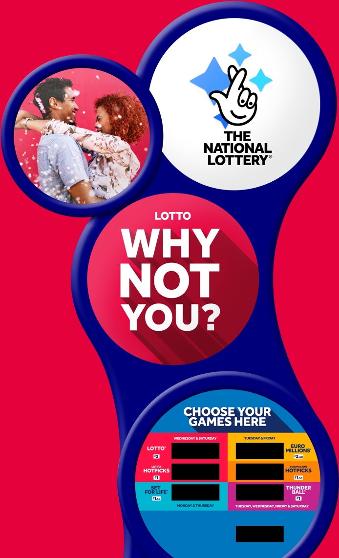
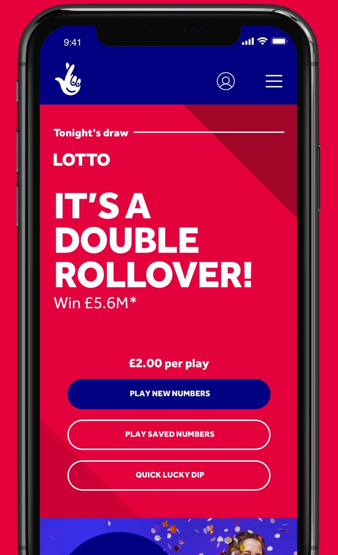
Hand-in-hand with the brand
At all points of the customer journey, make sure you're using the game logo and TNL logo within the same touchpoint, to ensure people connect the dots between the game and The National Lottery.
Logo misuse
Some of these might seem obvious, but don't do any of the following with the logo - we're all about appearing as consistently and reliably as possible.
Rotate
Distort or warp
Use other colours
Use gradients
Outline
Change the typeface
Adjust spacing
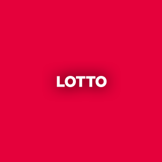
Use drop shadows
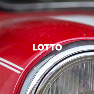
Overlay busy images
Forget accessibility
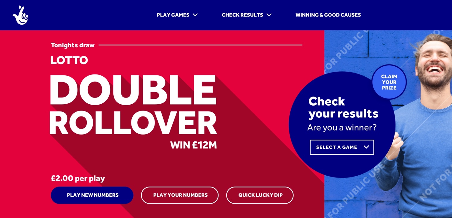
System in use
Find more examples of how assets come to life at the 'System in Action' page.
To see more examples of how the
assets come to life see the
‘system in action’ page.
Previous section
Next section