The wins are out-of-this-world… and so is the buzz we make, delivering mind-boggling jackpots and epic experiences at every turn.
Inspire players to let their imaginations run wild.
Core principles
To bring the EuroMillions identity to life, there are a few simple principles to follow.
All TNL imagery must...
01
Capture moments of joy that feel candid and fully in the moment, never staged. And always feature a mixture of sexes, ethnicities and ages over 25.
02
All imagery should feel bright, colourful and full of optimism – using
natural light whenever possible.
03
Less is more, so keep imagery simple with an obvious focal point
All EuroMillions imagery must...
04
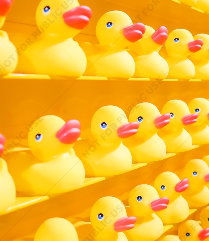
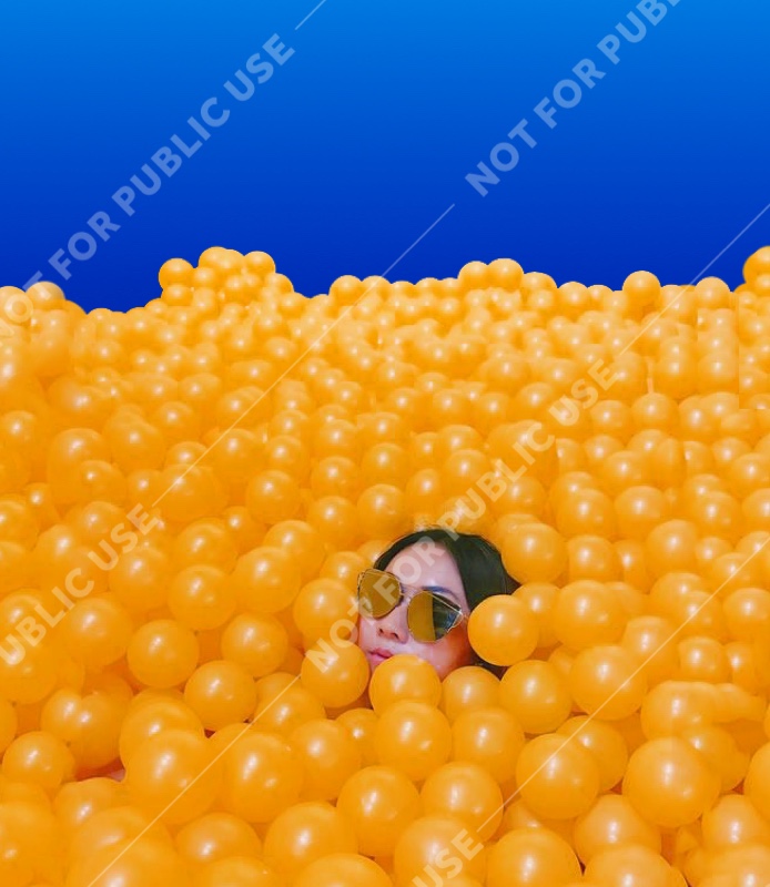
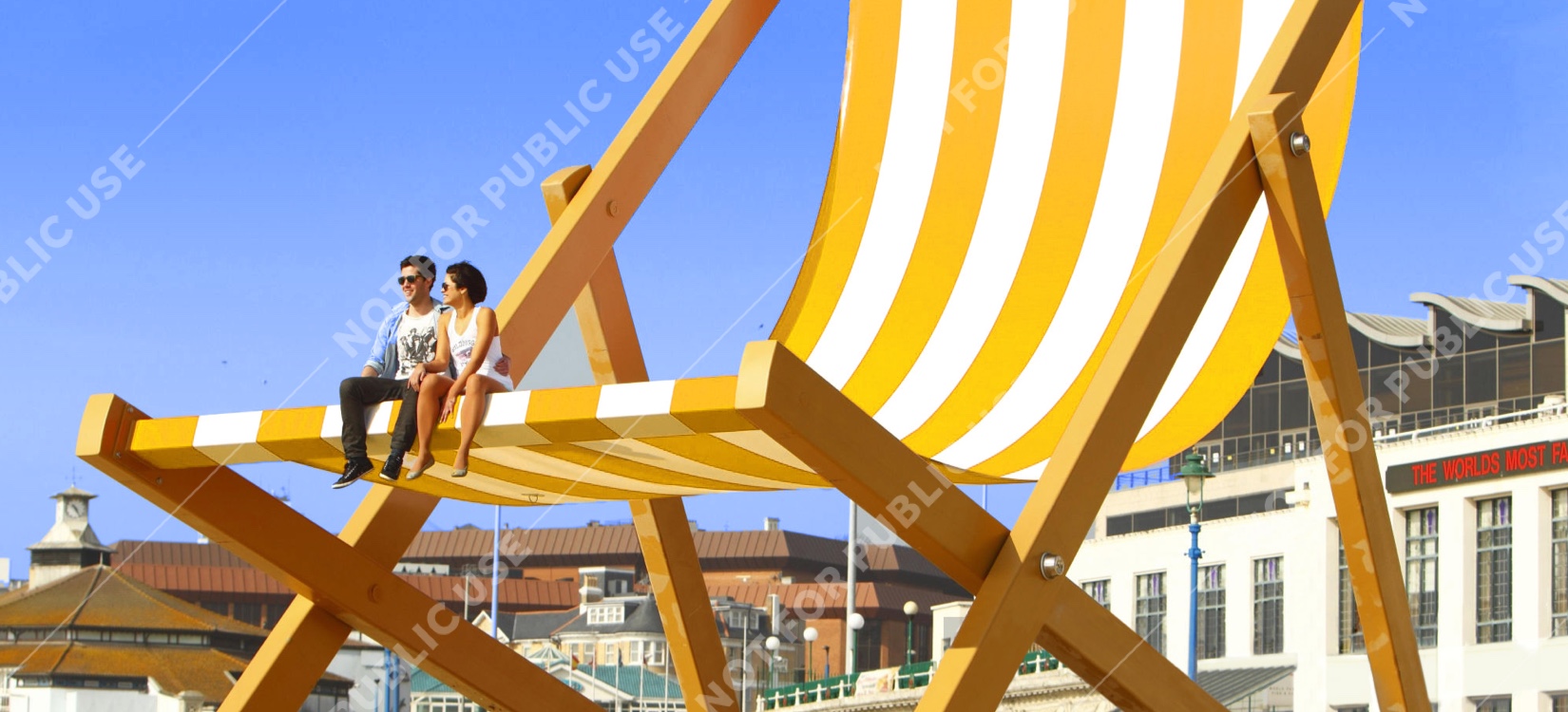
Use game yellow throughout – from pops of colour in clothing and props, to full-bleed backgrounds – to aid navigation and bring Euromillions to life.
05
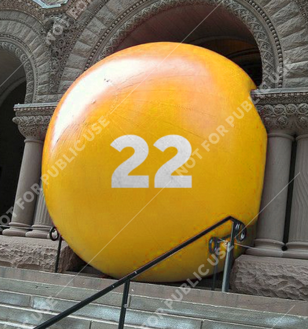
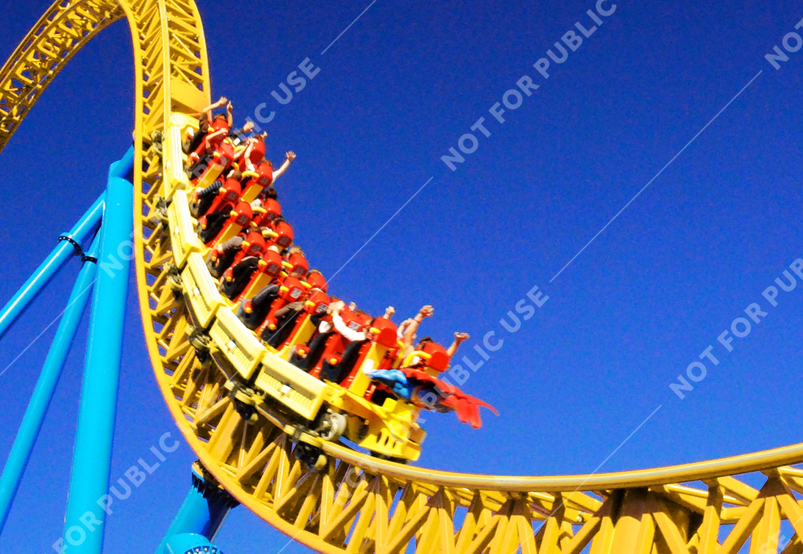
Imagery should evoke out-of-this-world excitement and possibilities. We do this in a few ways. Aspirational places. Abundant objects. People with larger-than-life reactions. And low-camera angles that make anything feel epic.
06
The people we feature are experiencing extreme emotions and glamorous, larger-than-life environments. But despite this, the actual people themselves should still feel real and relatable. We want people to be able to imagine themselves in their shoes - no matter how glitzy the shoes.
What to photograph
Imagery that feels escapist, highly aspirational and larger-than-life – just like our jackpots. For instance, we freely use global locations, evocative of the lifestyles our winners have. But whilst we’re not afraid to show off and be a little flashy, Euromillions should never feel snooty or elitist.
The visuals below are intended to be inspirational, rather than instructive. Images shown are not for external publication.
Previous section
Next section
