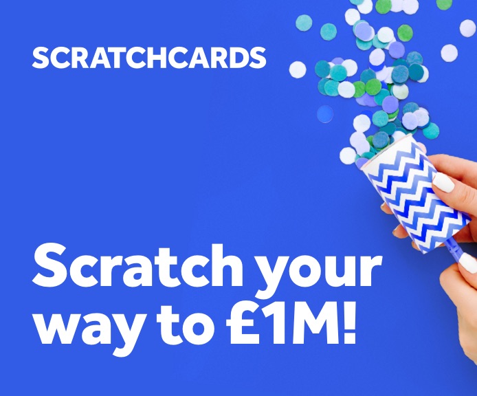
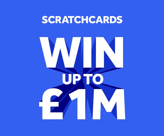
Scratchcards is all about the vibrant choice games at your fingertips that you can win in an instant.
The one, the only, the original. This is the game that brings people together up and down the UK and Northern Ireland.
In our new visual system, colour is king - helping to bring each game to life and aiding navigation.
Palette
Royal blue is our hero colour. The shadow, secondary and tertiary blues should only be used with extruded type and the game pattern detailed below.

Royal blue
#3460F2
C: 90 M: 48 Y: 0 K: 0
Pantone 285C

Heritage blue
#000080
C: 100 M: 95 Y: 0 K: 30
Pantone 2748C

Royal blue shadow
#1432C8
C: 90 M: 72 Y: 0 K: 0
Pantone 2782C

Secondary blue
#4F7BF7
C: 70 M: 48 Y: 0 K: 0
Pantone 2727C
Background pattern
Colour & backgrounds
All games have their own pattern, based on the distinctive character of their extruded type. They're made to break up an empty canvas and add depth, so avoid using them with extruded type or imagery wherever possible.

Accessibility
Accessibility standards have been set to AA, so that our digital platforms can be enjoyed by everyone. AA requires a contrast ratio of at least 4.5:1.
5.12
Royal blue
Distort or wrap
Distort or wrap
16.01
Heritage blue
Distort or wrap
Distort or wrap
9.05
Royal blue shadow
Distort or wrap
Distort or wrap
4.20
Secondary blue
Distort or wrap
Distort or wrap
Usage percent
As a guide for your design work, primarily use royal blue, and support it with the other shades of blue when creating the extruded type and pattern to help create a balance similar to that shown below.

System in use
System in use
Find more examples of how assets come to life at the 'System in Action'.
To see more examples of how the
assets come to life see the
‘system in action’ page.
To see more examples of how the assets come to life see the ‘system in action’ page.


Previous section
Next section