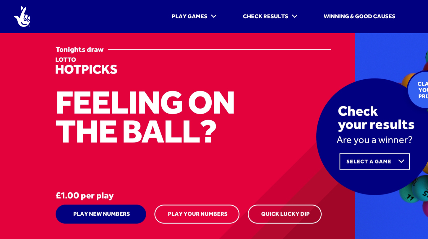
This is the cherry on top of the nation's game - an extra chance for players to win, on their own terms.
In our new visual system, colour is king - helping to bring each game to life and aiding navigation.
Palette
Lotto red is our hero colour. The shadow, secondary and tertiary reds should only be used with extruded type and the game pattern detailed below.

Lotto red
#E5013B
C: 0 M: 100 Y: 72 K: 0
Pantone 206C

Lotto core shadow
#A10628
C: 24 M: 100 Y: 79 K: 22
Pantone 7637C

Secondary red
#B50A2F
C: 20 M: 100 Y: 75 K: 12
Pantone 207C

Tertiary red
#CC0034
C: 13 M: 100 Y: 73 K: 4
Pantone 7636C

Detailed extrusions
#870522
C: 20 M: 100 Y: 70 K: 40
Pantone 188C
Background pattern
All games have their own pattern, based on the distinctive character of their extruded type. They're made to break up an empty canvas and add depth, so avoid using them with extruded type or imagery wherever possible.

Accessibility
Accessibility standards have been set to AA, so that our digital platforms can be enjoyed by everyone. AA requires a contrast ratio of at least 4.5:1.
4.77
Lotto red
Distort or wrap
8.16
Lotto core shadow
Distort or wrap
6.89
Secondary red
Distort or wrap
5.81
Tertiary red
Distort or wrap
10.12
Extusion detail
Distort or wrap
Usage percent
As a guide for your design work, the below is an indication of how the Lotto gameworld should look. Primarily Lotto Red, but supported with shades of red when extruded type and pattern are used.

System in use
System in use
Find more examples of how assets come to life at the 'System in Action'.
To see more examples of how the
assets come to life see the
‘system in action’ page.
To see more examples of how the assets come to life see the ‘system in action’ page.


Previous section
Next section